 |
| The twenty year slide in Violent and Property crime in King County. King County (2014 pop = 2M) dominates WA trends in crime by virtue of its size and prosperity. Click to Enlarge. |
RMF: "I do not understand. How does my state know how to spend my tax dollars if no one at the state level analyzes law enforcement data?"
OFM Analyst : "County and city law enforcement organizations receive their funding locally, not from the state. Each county/city most likely analyzes their own data to determine what areas to focus on." from an email thread of author with OFM.
"Jail planning is not based upon the strict application of a numerical standard contained in the existing LOS. Therefore, the numerical standard would be replaced with new Policy 4D-2, which supports construction of a new jail to safely provide needed corrections facilities over the 20-year planning period." from draft Chapter 4, Whatcom County Comprehensive Plan for Capital Facilities , April 10, 2015. [Bold for these quotes added by author for emphasis -RMF]
Introduction
This is my second in a series of posts about crime and jail population in WA state. Code for this post is here. There is a council meeting on Tuesday, April 14th 7:00 PM. The Chief Executive and the Sheriff are proposing $122M for the new jail and headquarters. A general complaint is that there is not enough data. The proposal needs individual city approval and additional 2/10 of 1% Sales Tax approved. This will be added to the existing 1/10 of 1% already in place. Sites where I found data and reports include: cfc.wa.gov, ofm.wa.gov, waspc.org , fbi.gov, bjs.gov, www.co.whatcom.wa.us, cob.org . For a more extensive listing, see End Notes.An appropriate analysis of crime and law enforcement spending is far too complex to be achieved in any short period of time. Since talking with Joy Gilfilen and Irene Morgan of the Whatcom County "Restorative Justice" group three weeks ago, I have put some 80 - 100 odd hours into understanding, graphing, analyzing, crime statistics. I would need at least 10x those hours to have any confidence in all but the most rudimentary conclusions and perhaps many more hours to understand the complexity of crime and the impact of law enforcement spending on any small community. In my first post, I attempted to show a relationship between high tech employment and lower crime totals in select cities. In this post, I describe crime statistics in more detail and look at cross county comparisons. My 'End Notes' list an extensive set of URLs with data repositories and reporting on crime.
Among the conclusions I have made so far is that WA state and many of its small counties are not using data analysis enough to make appropriate decisions about law enforcement and incarceration spending. Although the FBI, WASPC, OFM and other agencies collect extensive crime data, little analysis is available that would help communities predict criminal outcomes and and their relationships to conditioning factors like high-tech employment, poverty, household makeup, etc. My guess is that this 'analysis void' leaves many small counties like Whatcom "on our own" to make what are essentially 'reactionary' judgments on long term spending based on exigent conditions (e.g. overcrowded jails, spikes in crime, public complaint, etc.) . The lack of useful predictions for long term trends in crime means that law enforcement resources will be continuously either underfunded or overfunded in comparison to other social or economic government spending, some of which may have strong(er) ameliorative effects on public safety than law enforcement spending itself.
Shift to NIBRS from UCR
Notes about the data for graphs ( http://www.ofm.wa.gov/sac/dnld/ucr_94_13.xlsx ) :- I am comparing relatively similar sized WA county pairs.
- UCR is not being maintained as the standard crime reporting method by everyone as of 2012 and/or 2013.
- Analysis of NIBRS data (2012,2013) is not included here. There is no conversion routine between UCR and NIBRS so for 2012 and 2013 data I will have to create a separate analysis in another post for those two years.
- For property crime/population to appear on my per capita graphs I do (PTOTAL * 10)/POP. Add one zero immediately to the right of the decimal point to get the true rate.
The shift from UCR to NIBRS has been done without a translation routine between the two standards. This effectively removes a continuous historical metric of crime. Tables below explain this. The first table is UCR for 2012. The second table is UCR for 2013. Only six counties maintained partial UCR stats for 2012; only four maintained partial UCR stats for 2013.
COUNTY POPULATION VTOTAL PTOTAL
1 KING 841815 2022 27241
2 SNOHOMISH 633588 1016 15622
3 SPOKANE 449100 1708 27407
4 THURSTON 116102 274 4403
5 WHATCOM 87921 328 1137
6 PIERCE 16398 65 894
arrange(as.data.frame(aggregate(cbind(POPULATION,VTOTAL,PTOTAL) ~ COUNTY,data=subset(ucr94_13,LOCATION =="COUNTY TOTAL" & INDEXYEAR == 2013),sum)),desc(POPULATION))
COUNTY POPULATION VTOTAL PTOTAL
1 KING 653585 1048 17703
2 SNOHOMISH 611421 1198 20305
3 SPOKANE 452805 1763 28712
4 WHATCOM 88276 157 1340
State Population
OFM estimates the 2014 WA State population at nearly 7M . Since 2010, we have added ~250K in WA. The top three counties (King, Pierce, Snohomish) constitute over half of the WA population. King County is 2M . Here is a look at the top 13 counties, each of which have over 100K as of 2014. Those 13 counties constitute ~88% of WA total population. OFM estimates the percentage growth from 2010 to 2014 in OFM_PCT. I use RMF_PCT = 1 - (2010pop/2014pop)).
Any county close to Puget Sound or any growing urban area in WA is marching along at a healthy growth rate. We are no longer a small state in any way. In ten years, with enough frozen Midwesterners and parched Californians ready to relocate to our rain soaked state, WA population could breach 10M. One argument for a large jail is the face of expected growth could be this: Urban areas in WA counties that aren't now thinking and planning seriously about how to deal with cartels, gangs, crime, poverty, homelessness, prosperity and growth will regret they did not.
| Counties | 2010 | 2014 | NET | RMF_PCT | OFM_PCT |
| Washington | 6,724,540 | 6,968,170 | 243,630 | 3.50% | 3.62 |
| King | 1,931,249 | 2,017,250 | 86,001 | 4.26% | 4.45 |
| Pierce | 795,225 | 821,300 | 26,075 | 3.17% | 3.28 |
| Snohomish | 713,335 | 741,000 | 27,665 | 3.73% | 3.88 |
| Spokane | 471,221 | 484,500 | 13,279 | 2.74% | 2.82 |
| Clark | 425,363 | 442,800 | 17,437 | 3.94% | 4.1 |
| Thurston | 252,264 | 264,000 | 11,736 | 4.45% | 4.65 |
| Kitsap | 251,133 | 255,900 | 4,767 | 1.86% | 1.9 |
| Yakima | 243,231 | 248,800 | 5,569 | 2.24% | 2.29 |
| Whatcom | 201,140 | 207,600 | 6,460 | 3.11% | 3.21 |
| Benton | 175,177 | 186,500 | 11,323 | 6.07% | 6.46 |
| Skagit | 116,901 | 119,500 | 2,599 | 2.17% | 2.22 |
| Cowlitz | 102,410 | 103,700 | 1,290 | 1.24% | 1.26 |
| Top 13 | 5,678,649 | 5,892,850 | 214,201 | 3.63% | |
| PCT_TOP13 | 84.45% | 84.57% | 87.92% |
What have violent and property crime levels looked like in the last 18 years of UCR measured crime as WA has grown? The smoothed lines below show a continuing drop in both property and violent crime. Crime is often a very personal and/or regional experience. But the historical UCR crime stats for WA paint a picture of a state showing a continuous and significant decline in both violent and property crime. Click to enlarge.
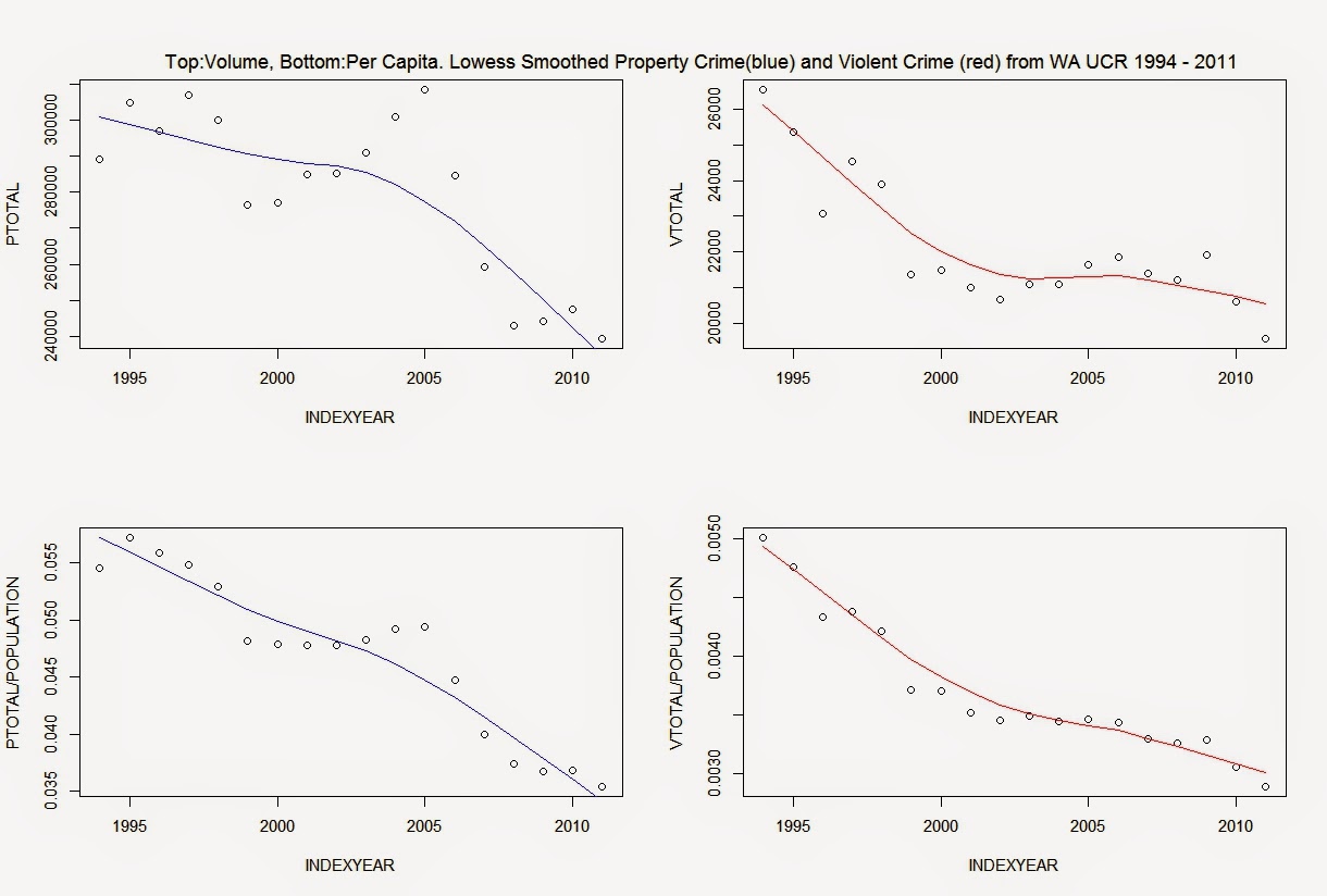
Both the FBI and WASPC recommend against crime comparison between cities and urban areas. This advice doesn't help analysis much. At some point we have to understand crime as a result of cross comparison between urban and/or county policies. Only data metrics help us understand the resultant differences. The table below is UCR data from 2011 'VTOTAL' is violent crime. 'PTOTAL' is property crime. Some pairs of counties that somewhat compare for population are highlighted below. Notice that both violent and property crime rates are on a twenty year slide in the charts far below, save recent upticks in property crime totals for Pierce, Snohomish, and Spokane.
arrange(as.data.frame(aggregate(cbind(POPULATION,VTOTAL,PTOTAL) ~ COUNTY,data=subset(ucr94_13,LOCATION =="COUNTY TOTAL" & INDEXYEAR == 2011),sum)),desc(POPULATION))
2011UCR: COUNTY POPULATION VTOTAL PTOTAL
1 KING 1966075 6776 78116
2 PIERCE 795245 3339 31126
3 SNOHOMISH 700430 1197 19962
4 SPOKANE 472650 1644 24697
5 CLARK 427915 961 11476
6 THURSTON 254100 555 7015
7 KITSAP 253900 782 7352
8 YAKIMA 244700 808 10496
9 WHATCOM 202100 449 6398
10 BENTON 177900 415 5055
11 SKAGIT 117400 240 5210
12 COWLITZ 102785 315 3489
13 GRANT 85075 251 3770
14 FRANKLIN 80500 238 1816
15 ISLAND 78800 96 1440
Comparing Counties
Comparing crime across jurisdictions is problematic because of the multivariate nature of crime and crime reporting. Long term initiatives have been in place in the United States to standardize crime reporting across regional jurisdictions. Despite continual revisions, crime data (like all social data) is rarely perfect and reliable [1]. Cross jurisdiction comparisons are valuable and integral to developing crime policy for this reason: As our planet grows, we become more and more a collection of "city-states" or urban metropolitan areas. All planning for growth, economy, trade, business development, law enforcement has tended to become more regional and urban than not. Thus, the policies and decisions made by local and county officials in the United States have impacts on public safety and quality of life at least equivalent to national initiatives. To this end alone, local decisions may often determine the future of local crime rate more any other factor. This makes crime rates across jurisdictions worthwhile to compare on a policy level alone.
Pierce vs. Snohomish
Violent crime rate drops in Pierce County are substantially noticeable. The recent uptick noted in property crime may more related to NIBRS/UCR split reporting. However, Snohomish appears to be seeing an increase in both property crime by volume and per capita. Heroin use and deaths are a recent issue for Snohomish. [1, 2] .Recent news articles note that jails in Western Washington are not being filled because of tax funding limitations. [1,2]

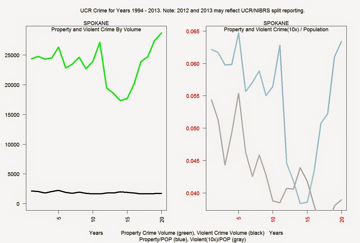
Clark vs. Spokane
Clark county is experiencing a drop in both violent and property crime rates. Spokane is dealing with an uptick in property crime rates. There is a lot of discussion about this in Spokane. Someone has put up a pretty nice interactive crime map in Spokane. There is talk of a Heroin spike in Spokane [1].

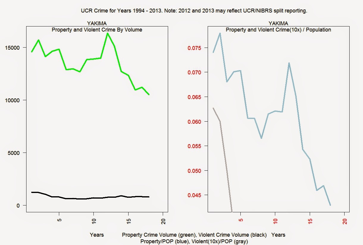
Yakima vs. Whatcom
Statistics show both Yakima and Whatcom County are seeing long term drops in reported violent and property crimes. Yakima and Whatcom County are much smaller counties than the rest of the top ten counties in WA. Yakima has historically had a much higher crime rate than Whatcom county. Recent data shows its crime rates are decreasing. Property crime in Whatcom county has suffered a dramatic decrease since 2005.
Coplots
The 'coplots' below give a more complicated look of Washington States growth and decline in violent and property crime. An R coplot graphs "co.intervals(., number, .) returns a (number x 2) matrix, say ci, where ci[k,] is the range of x values for the k-th interval." So below I chart property and violent crime plotted by year conditioned on population. This gives the 'frequentist' (as opposed to Bayesian) set of intervals for data specific to time periods. Read these charts from left to right and bottom to top. For property ('PTOTAL') and violent ('VTOTAL') crime match the crime ~ year curves to the respective "Given" population bars . Read those bars from bottom (left) to top (right).The general visual effect of these coplots are the converse of either smoothed lines or long term charts. The viewer can ascertain smaller trends for short periods because coplots return a more granular look at crime trends as individual segments of time. These short periods probably correspond more closely to periods that law enforcement and the court system use to adjust practice and methodology.
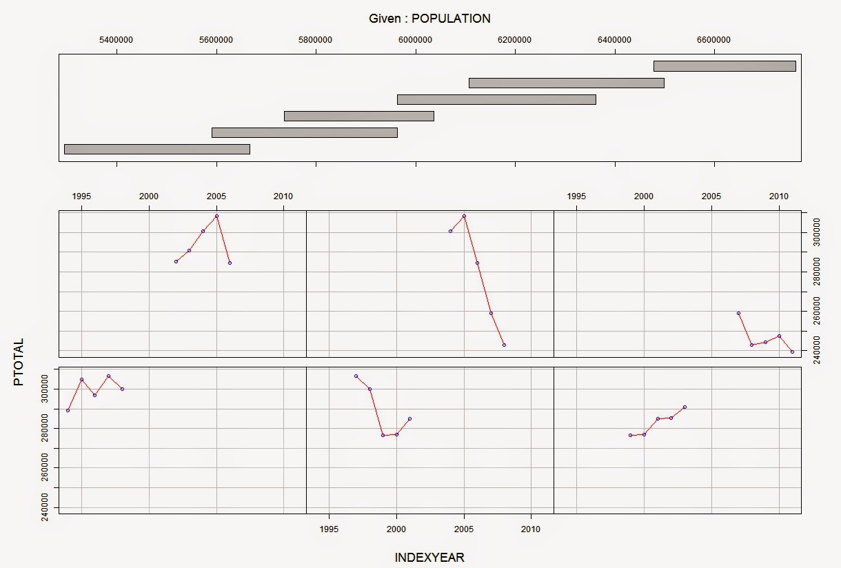 |
| Coplot for UCR property crime recorded for the state of WA for years 1994 - 2013: coplot(PTOTAL ~ INDEXYEAR | POPULATION) |
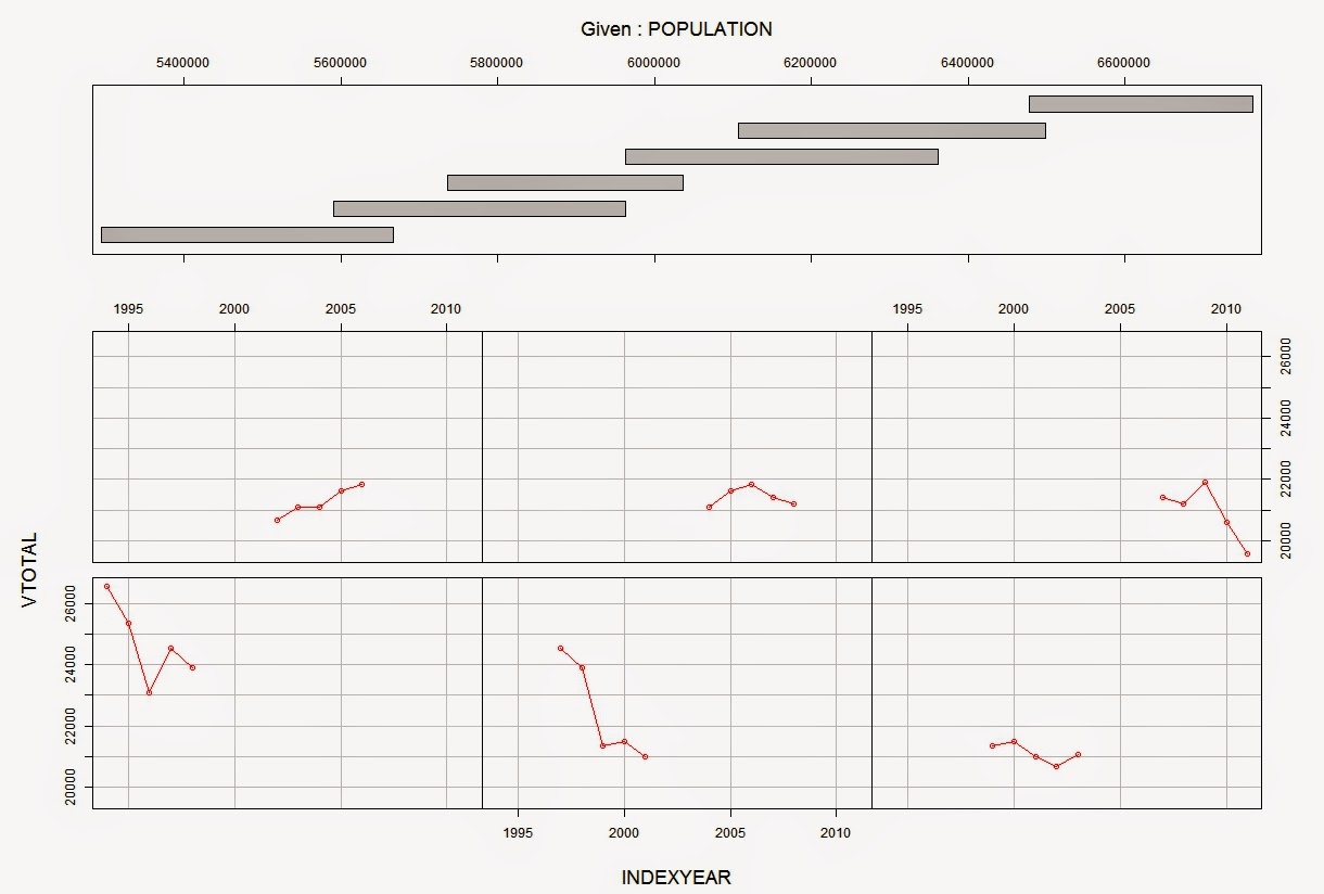 |
| Coplot for UCR violent crime recorded for the state of WA for years 1994 - 2013: coplot(VTOTAL ~ INDEXYEAR | POPULATION) |
End Notes
Data Repositories and data reporting
Sources include:
- http://www.cfc.wa.gov/Data_Warehouse.htm
- http://www.ofm.wa.gov/sac/cjdatabook/intro.asp
- http://www.ofm.wa.gov/sac/data.asp
- http://www.ofm.wa.gov/sac/cjdatabook/default.asp
- http://www.ofm.wa.gov/pop/april1/poptrends.pdf
- http://www.waspc.org/cjis-statistics---reports
- http://www.waspc.org/cjis-training--manuals---reference
- http://www.fbi.gov/about-us/cjis/ucr/ucr
- http://www.fbi.gov/about-us/cjis/ucr/nibrs/2013
- http://www.bjs.gov/index.cfm?ty=dca
- http://www.co.whatcom.wa.us/200/Sheriff
- http://www.co.whatcom.wa.us/716/Data
- http://www.cob.org/PIRCrimeStatistics
- http://www.cob.org/services/maps/
- https://www.fas.org/sgp/crs/misc/RL34309.pdf
1 comment:
Thank you, so much Ryan, for the volunteer research you did here.
This is work I cannot do, nor can very many people. It was not done for the current jail proposal either...at least nowhere where I could see this level of accuracy and data.
The people of Whatcom County are better for it, and I deeply appreciate it. This is the kind of critical need to know information before projections can be made based on facts. And this is very different information than the occupancy rates and jail bed stays. Those depend on the administration of justice, not on the actual rates of crime.
What you provided here is one window of data we need in planning and in doing a proper Needs Analysis. Thank you again.
Post a Comment